
Customer needs
Business goals
user interviews
current site audit
competitor analysis
problem definition
user flow mapping
data synthesis
wireframe ideation
iterative mockups
interactive prototypes
finalize content
accessibility check
engineering handoff
6 rounds of design iterations and review with product, engineering, and stakeholders
3 review rounds with design leadership
2 rounds of user testing
2 rounds of peer design feedback
2 UI/branding working sessions with the marketing design team
1 review session with the CEO
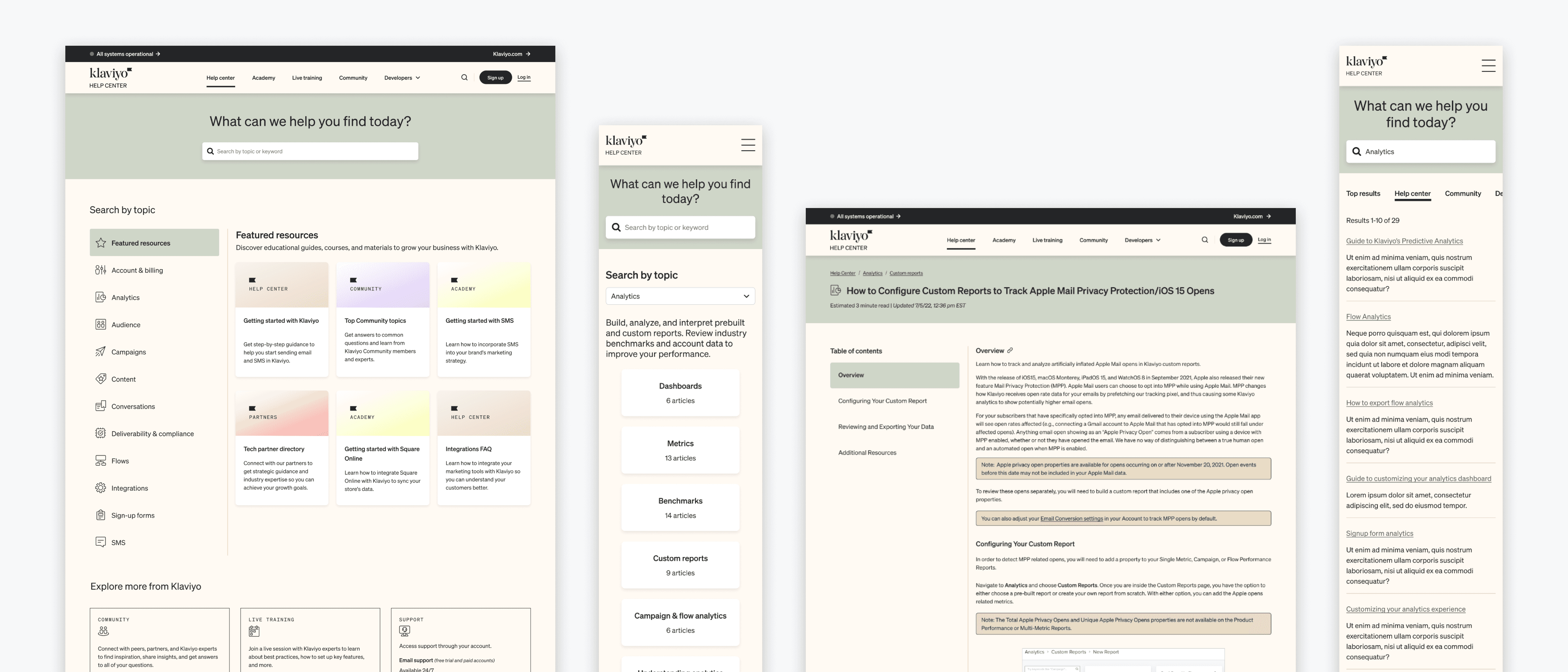
Persistent left navigation anchors every page across the site, giving users a point of orientation, and clear categories that mirror the areas in the Klaviyo app
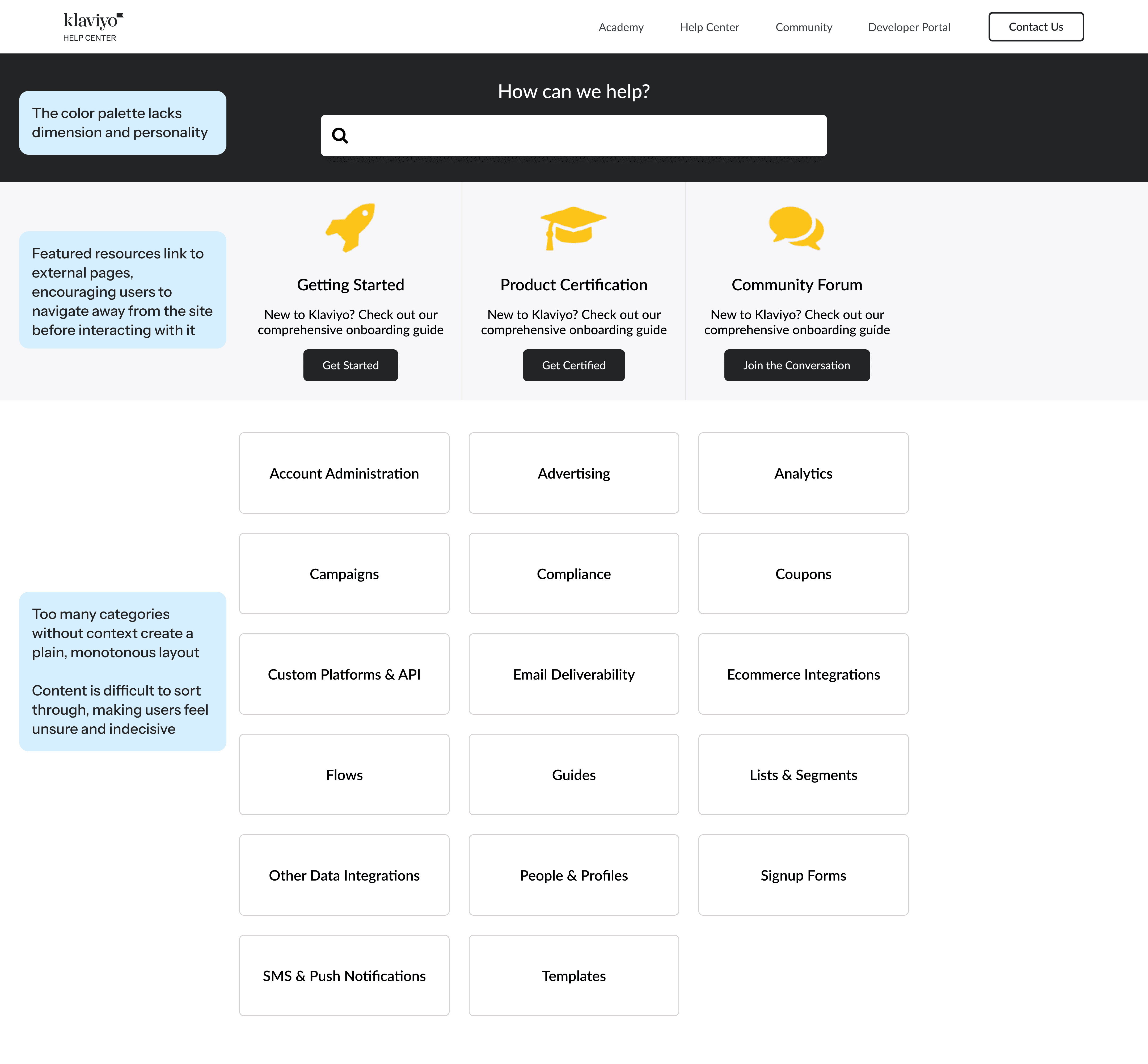
Featured resource cards provide distinct, relevant sections with simple descriptions
Links to community, live training, and support are located at the bottom throughout the site, keeping them accessible without distracting from the main documentation
The updated color palette creates cohesion with Klaviyo's marketing site branding

Progressive disclosure lets users drill down at their own pace, processing only the info most relevant to them at each step
Selecting a category from the left navigation displays a corresponding short description, along with sub-categories and top articles
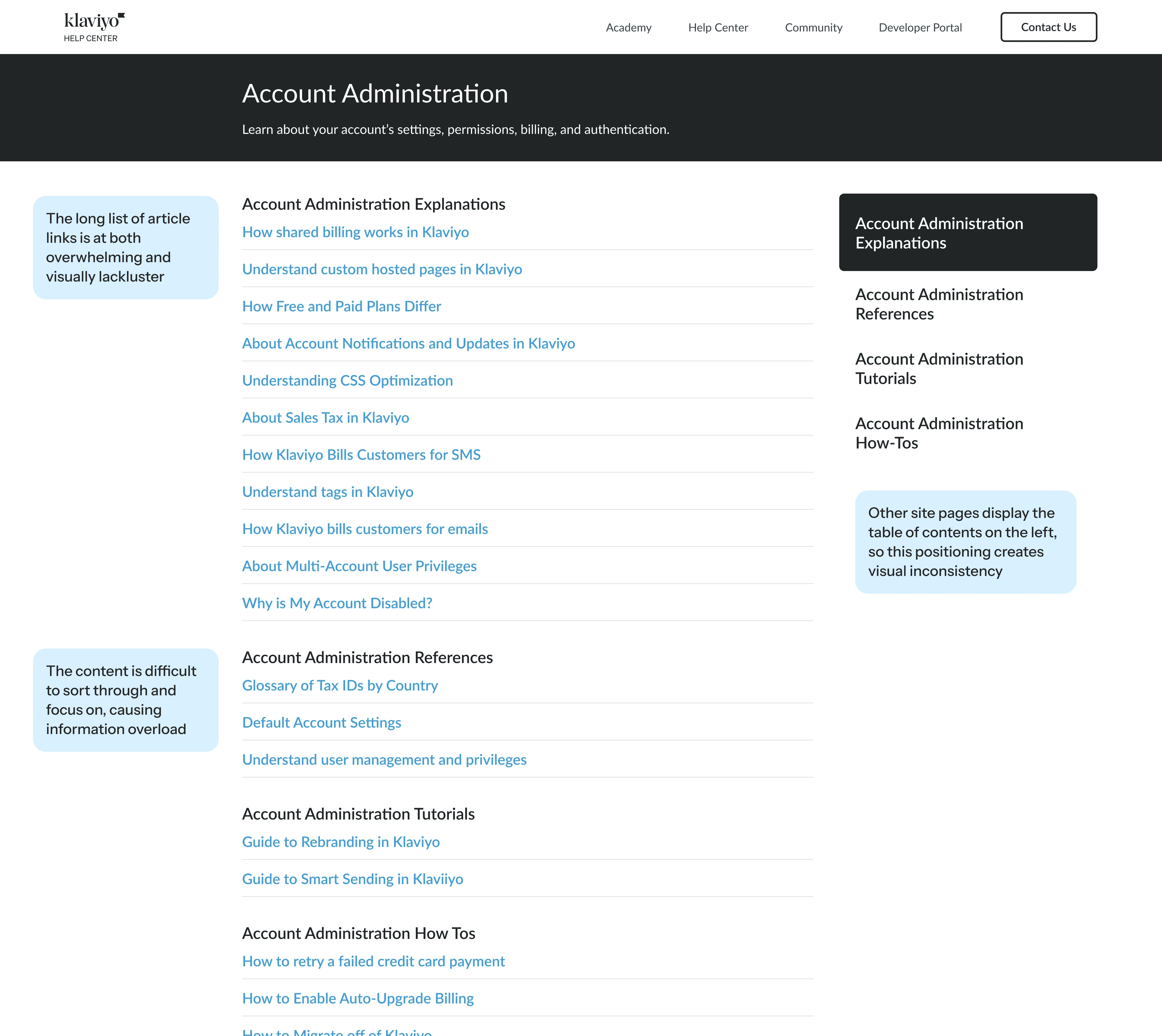
Once a sub-category is selected, articles are organized under clear, descriptive headers for easy scanning
Breadcrumb navigation orients users so they can move freely between intermediate pages without losing their place

A new header bar provides breadcrumb navigation for orientation, an estimated read time so users know their commitment upfront, and a last-updated timestamp so they know the info is current
The table of contents is fixed on scroll, so users can always see and jump to any section from wherever they are on the page
Text styles were updated to improve visual hierarchy and scannability
Stylized callout blocks were added to surface important info that might otherwise be easy to miss

The results were significant across every metric we tracked.
decreased by 81%
Meaning: Users could get straight to what they need.
nearly 2x as often
Meaning: Users are following the path we designed for them.
65% faster
Meaning: Users spent less time searching and more time getting answers.
decreased by 2/3
Meaning: Users are browsing and clicking through instead of bouncing.
